
wellements.com
Wellements® Clean Organic Baby Care Products. Natural Remedies, Vitamins, and Minerals to calm, soothe,
protect, and promote wellbeing from infant to child.
EXPERIENCE MAPPING, STRATEGIC ANALYSIS, VISUAL DESIGN, UI/UX DESIGN
Challenge: To meet unrecognized user needs by iterating the checkout process and adding a subscription, bundle, and a gifting option at the checkout. Making it easy to send the purchased items to a friend or family member.
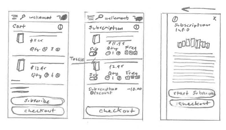
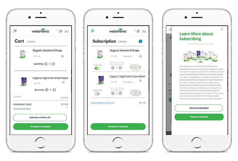
Solution: By optimizing the clickstream, we reduced the checkout process to an easy two-step process. This affordance helped validate the ease of purchasing product bundles for extra savings. Then after the order summary, gifting was presented with the option to add a personalized message at checkout.
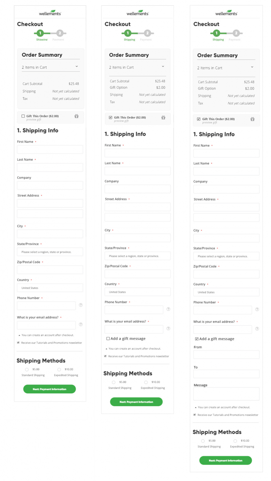
Outcome: We then improved on the out by offering an opportunity to leave a personalized gifting message at checkout. We regularly check up on the performance and determine if it was successful and where we need to improve. Using KPI metrics, Wellements was able to quantify the bundling and gifting objective.
Challenge: The client wanted to engage the customer with a personalized savings. By analyzing user case scenarios we found that they were incentivized by the added value of related articles in the blog. Our research also concluded that the customers prefer an exclusive offer to be directed to them nonchalantly.
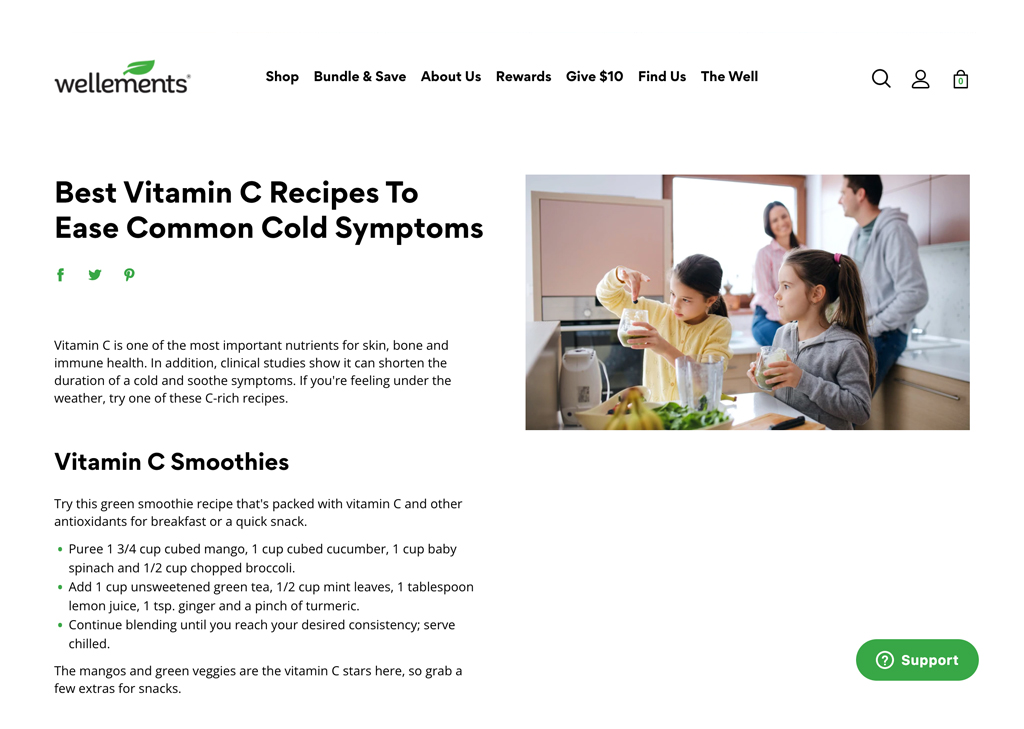
Solution: Qualitative research helped us understand the product better, along with helping to determine the pain points and easy fixes that could be leveraged with design. We found that the user was less apprehensive about entering their email for a discount after engaging with an article in “THE WELL” and didn’t want an unexpected pop-up interruption while busy reading. So remaining subtle, we presented a modal when they finished their current activity.
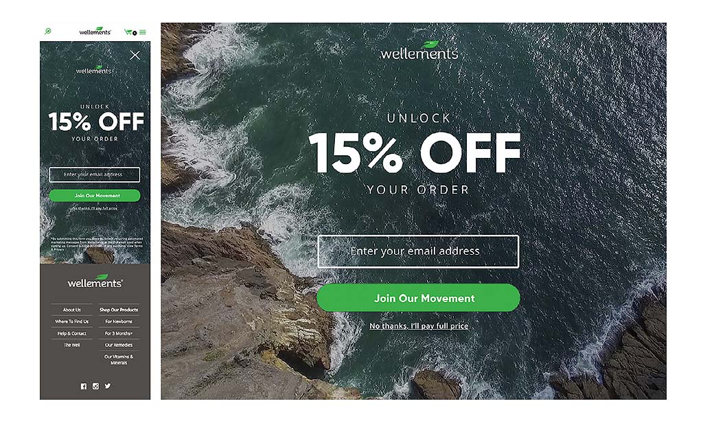
Outcome: The client was able to monetize the modals’ performance and found a 60% increase in the email captures and use of the coupon code at checkout; this increased the sales of their top three performers.
Challenge: Products needed to be purchased either online or in-store. Through heat map testing, we discovered customer insights and found that the highest concentration of drop-off was at the checkout. Therefore, task efficiency could be increased by adding store geo-locating to the purchase funnel.
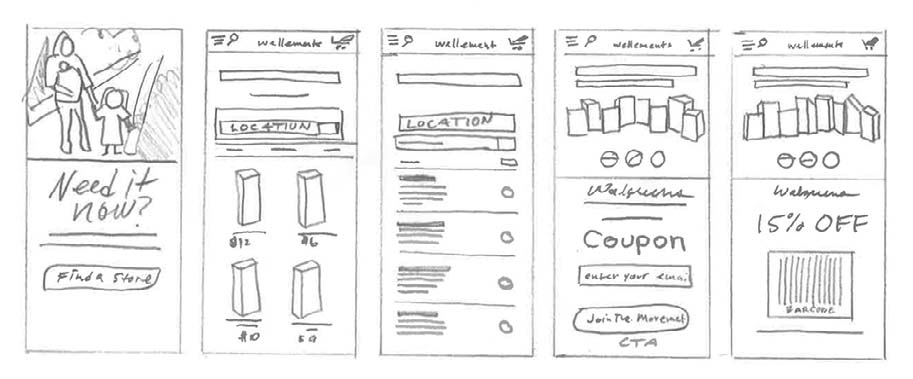
Solution: We designed a simple two-step process to find the store nearest to the user with the zip code=location field. Building partnerships, we highlighted the top re-sellers by providing the user with a scannable coupon that they could use at the time of purchase.
Outcome: We implemented components and enhanced the user’s experience without compromising the services provided by the site. After aggregating and sharing data, our team identified the most pertinent design problems and chose the top parent themes to incorporate as solutions. In defining processes and understanding our user base, a properly defined structure was put into place.
Challenge was to address the customer’s decisive assumptions on how a subscription saves money in the long run. After the initial launch, the client asked us to streamline the arduous subscription process by resolving user pain points and reducing bounce rates.
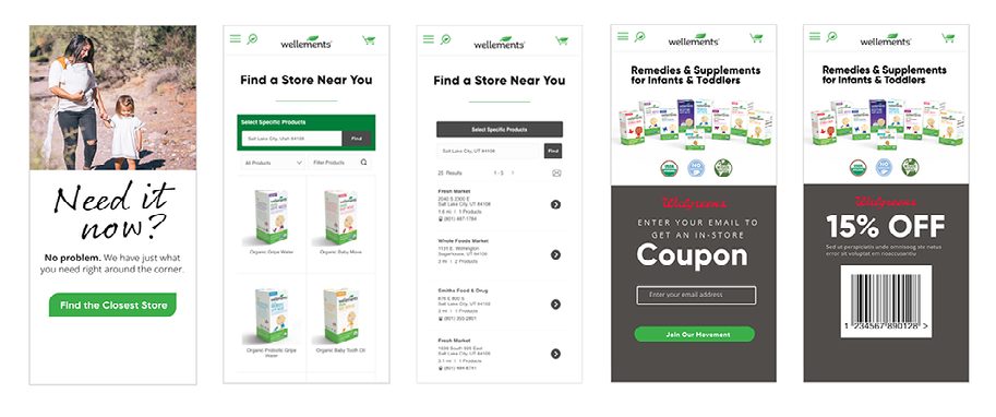
Solution: Quantitative research concluded by limiting CTAs and extra steps, we could create a better purchase funnel by establishing a more robust co-existing hierarchy tailored to meet the user’s specific needs. We set a better value proposition and increased overall customer satisfaction using this information.
Outcome: By receiving and integrating customer feedback, we could meet the client’s expectations. We didn’t see an uptick in subscriptions, but the numbers remain consistent with the numbers we obtained post-redesign. So instead of a massive six steps, we optimized the process to a simple four steps. The new subscription functionality has been up and running, and everything is stable.